Pro-bel Logo: History of Permanent Fall Protection in North America
Pro-Bel has been part of the fall protection and suspended access industry since 1978. We copyrighted the first ever roof anchor in North America, leading it to become a staple of the industry. Today, we're happy to provide roof safety by implementing roof anchor systems around the globe. As a company, we have evolved in many ways over the last few decades, and as it happens, so has our logo. With the evolution of design trends, what attracts clients, and, of course, as Pro-Bel has grown, our logo has also changed to reflect all of this. Read on for a little throwback Thursday of some of our first logos and how they evolved into what you see today.
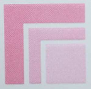
1978-1986
Our very first logo was created by Marc Lebel’s neighbor and is appropriately reminiscent of the 70s and 80s. Logos from those decades were all about breaking the rules: bold color combinations and unconventional use of shapes were popular. While Pro-Bel’s logo is a little more sober than some other classic 70s logos, the stacked square design and the use of purple and pink in the construction industry are unique.
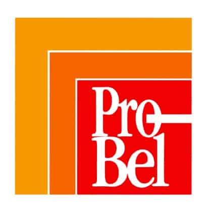
1987 – 1990
Near the end of the 80s, Pro-Bel made another update to the stacked logo. We added ‘Pro-Bel’ in serif font in the innermost square and changed the colors to yellow, orange, and red. Overall, these changes were a great update to the original logo.
1991 – 2008
We changed the logo again in 1991 and, this time, designed something completely different. The new logo was a play on the letters ‘P’ and ‘B’ by combining the two. Another unique design element that is very reminiscent of the early 2000s is the metallic texture added to part of the logo.
The 90s and early 2000s can be described as the decades that saw the rise of the Digital Age. This meant new applications, such as Adobe Illustrator, were more readily available to designers. Thus, the design options for logos became practically endless, resulting in logos that were layered, expressive, and often very literal representations of the products like tie-back anchors, window washing anchors, and all the fall protection services we offer.
2009 – present
Our most current logo, designed by one of our employees, is an updated version of the previous design. Today, minimalistic, flat logos are the most successful and easily distributable across different platforms.
What do you think of our Pro-Bel logo evolution? Do you have a favorite?
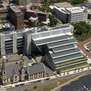
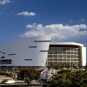
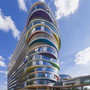
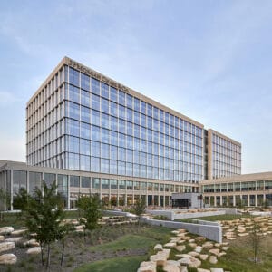
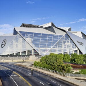
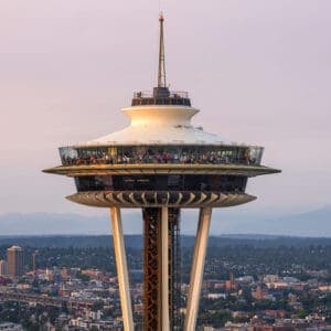
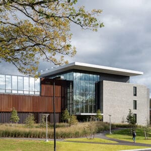
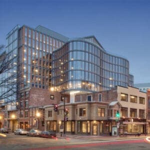
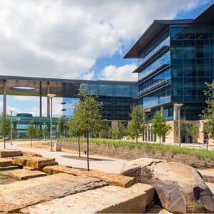
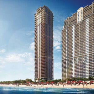
NOTABLE PRO-BEL PROJECTS


Share this Post